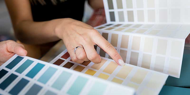
Color is the first design element people notice when they step into a room, and 2025 promises palettes that balance comfort with quiet confidence. Suppose you have been combing through home interior painting ideas or scrolling endless painting chart boards, looking for the perfect update.
In that case, this guide breaks down the top five trending interior paint colors that paint manufacturers and color forecasters say will dominate living rooms, bedrooms, and kitchens next year. Each shade is accompanied by practical application advice so you can easily translate runway-ready tones into real-world walls and trim.
1. Cinnamon Slate
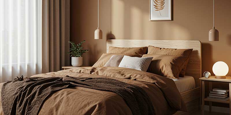
Unlike chocolatey browns that can shrink square footage, Cinnamon Slate’s muted purple content reflects enough light to keep tight spaces from feeling boxed in.
Cinnamon Slate’s earthy base harmonizes effortlessly with brass hardware, rattan furniture, and Scandinavian oak floors. Designers recommend amplifying its luxe undertone with textured throw blankets and velvet cushions, then grounding the scheme with ivory trim.
If you crave a popular wall color that still feels bespoke, this nuanced neutral earns its place on your short list.
2. Quietude
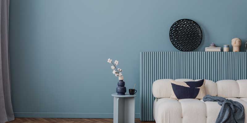
Because Quietude straddles warm and cool temperature zones, it complements brushed gold faucets and wicker pendants as easily as stainless fixtures and concrete tile. Layer it against linen shower curtains, jute rugs, or maple cabinetry to build an organic narrative that whispers calm.
Bedrooms or offices seldom seeing direct sun can appear chilly in pure blues. Quietude’s muted green inflection cancels gray undertones, lending fresh energy to darker corners without the saccharine sweetness of pastel mint.
3. Grounded
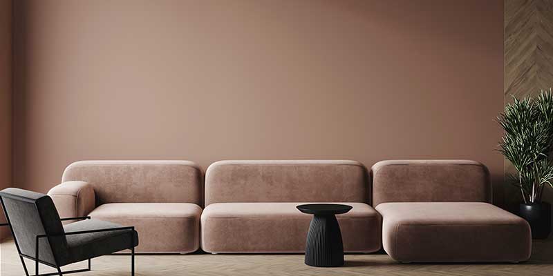
Grounded’s saturated profile allows modern art, patterned rugs, and leafy plants to pop without visual chaos. It behaves like a dark curtain on a stage, framing bolder pieces while contributing its own subtle melody. This brown delivers if you own statement furniture begging for a gallery-like setting. The finished palette feels curated, timeless, and deeply comforting, ideal for family dens or library nooks.
4. Charcoal
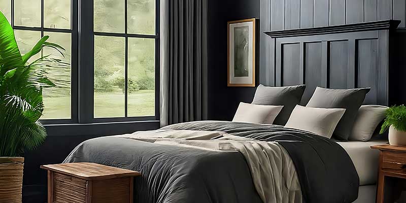
Homes and Gardens identifies charcoal, a near-black infused with soft graphite undertones, as the bold choice designers use to redefine contemporary elegance. Applied thoughtfully, this shade turns shelving, fireplace surrounds, or media walls into architectural sculptures, adding instant gravitas to otherwise simple footprints.
In spare interiors dominated by pale wood and linen, charcoal offers a grounding counterpoint that intensifies texture. A single feature wall behind a low-profile sofa or along a stairwell can elevate a minimalist scheme from plain to purposeful without the permanence of black paint.
Because charcoal absorbs significant light, interior designers urge homeowners to layer sconces, floor lamps, and LED strips behind artwork.
5. Warm White
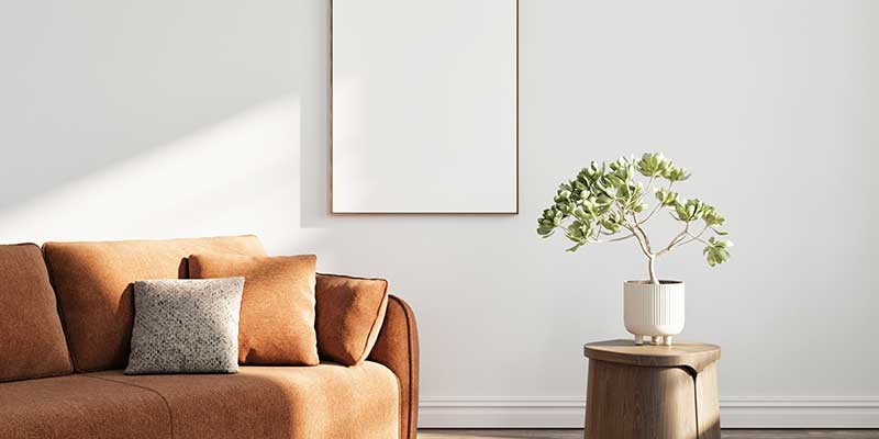
Crisp cool whites can glare under midday sun, while warm versions reflect light more gently, expanding square footage without sterile overtones.
Pro Tips for Choosing and Applying 2025’s Trend Colors
- Test Large Swatches Under Day: Paint skewing purple in morning light may appear brown at dusk. Designers recommend brushing two-foot squares of sample color on multiple walls and observing undertone shifts across a 24-hour cycle. Only then should you invest in gallons, preventing buyer’s remorse and ensuring your popular wall color resonates in every condition.
Some blues hide gray threads, and certain whites harbor yellow. Holding a fabric swatch or countertop sample against your test patch will reveal whether undertones clash or converse. - Pair Trend Hues With the Right Sheen for Each Room: Matte flats hide ceiling imperfections and diffuse glare, while low-sheen satins stand up to busy hallway fingerprints. Semi-gloss or gloss adds wipe-clean resilience to baseboards and doorframes. Matching sheen to traffic patterns is as critical as hue selection when planning an enduring interior paint job. Professional painters treat sheen like armor: matte diffuses, satin balances, gloss deflects. Adopting this trio ensures even 2025’s more audacious shades age gracefully under daily wear.
- Use a High-Quality Primer to Prevent Color Cast From Previous Paint: Skipping primer risks older colors bleeding through your new coat, distorting its intended personality. A dedicated bonding primer locks stains, seals pores, and provides the perfect neutral platform for Cinnamon Slate’s plum nuance or Charcoal’s graphite depth to read true.
Ready to Refresh Your Home?
Choosing among trending interior paint colors can feel overwhelming, but JC Carpentry & Painting makes the process effortless. Our color specialists arrive with curated fan decks and real-size sample boards.
By pairing our professional insight with next year’s visionary hues, you’ll achieve a space that feels fresh today and timeless tomorrow. Contact us now and start building the interior of your dreams with JC Carpentry & Painting.

